
Read the Data Science Experience project, to get a deeper insight on the process the UX team follows and also a bit around my role.
Overview
As any company in hyper growth phase, Qubole’s goals keep moving faster and farther. To keep the momentum going forward, our aim was two-fold,
- Next 1000 Logos: Bringing in net new customers
- Bigger Top 20: Increasing usage from current customers
The charter to achieve this goal, falls under the growth team that is compromised of a cross-functional members from design, product, marketing, sales and engineering.
Next 1000 Logos
As things stood,
A good funnel for trial form signups is in the 11.5% range. At Qubole, we saw that the number was lower and in the 3% range.
Also, a healthy SaaS organization sees 13% of their trial users convert to opportunities and around 6% of them convert to paid customers. So essentially around 4% of the trial users end up as paid customers. At Qubole, the percent of opportunity to prospect is around 1.4%.
Empathize
I looked into the number of steps a user needs to perform to run their first command since the time they clicked on “Try Now”. To do justice to the problem, it was necessary to divide it into smaller parts,
- Pre-signup: Flow through the Website and signing up for the trial
- Post-signup: Getting started experience for the new signed in user

Not only were the users required to go through a multitude of steps, but had to spend considerable amount of time to complete a step, specially around setting up credentials. We were seeing drop-offs at every stage and losing potential customers.
Define
To make for a seamless trial experience, it was important to set an ambitious goal for ourself and challenge any assumptions without regards to any constraints. We also knew users who ran their first command in the first day were 67% more likely to convert. So, we set a simple yet challenging goal,
Let users run their first commands in 5 minutes
Ideate
Pre signup

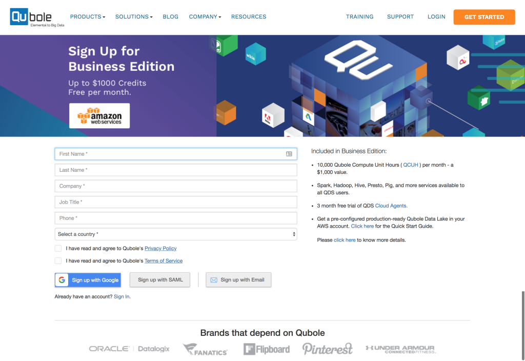
A user who comes with the intention to try Qubole, shouldn’t be thinking of which edition to choose, specially because there is only one edition she can try which is Business Edition. So it was really easy to get rid of the first decision point.

The second decision point on choosing the cloud provider (AWS, Azure, Google, Oracle) could be remove by defaulting to a particular cloud. We left it as is because of the following 2 reasons,
- Most of our users already have data on a particular provider
- Platform features and support can be cloud specific

Which brings us to the last drop-off point, the 7 questions we ask the user even before he signs up for the product. The easiest thing to do would be to remove all fields except email. However, turns out some of these questions related to demographics are key for business purposes and the persona/job title is a potential game changer for in-product personalization and notifications.
Instead of removing the fields altogether we did reduce the signup form to have only email and ask other questions later in the process, once users have already committed and were in the product, thereby greatly reducing the friction of giving up all info even before signup.
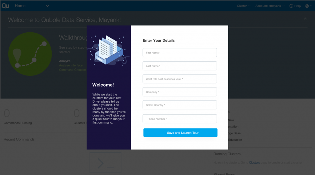
Post Signup
There were 9 drop-off points either because user’s needed to setup their account which required quite a bit of back and forth between their cloud provider and our platform or because they had choices to make even before they run their first command.
Instead of optimizing each step like earlier, we wouldn’t have gotten too far and nowhere near our goal of allowing users to run commands in 5 minutes.
This needed the team to think out of the box. The answer was simple, automate every step that users would usually have to do manually and remove decisions points.
Prototype
There were 11 potential drop off points in the old process. We not only brought it down to 2 but also reduced the complexity of the 2nd drop off point (sign up form).

Below are some before and after mocks as well as final visual designs done by the team,
-
- old sign up – 7 fields

-

- new sign up – 1 field + GDPR

-
- other details in product

-

- old banner with multiple choices

-

- new banner

-

- Data Science examples to get started

-

- Analyst examples to get started

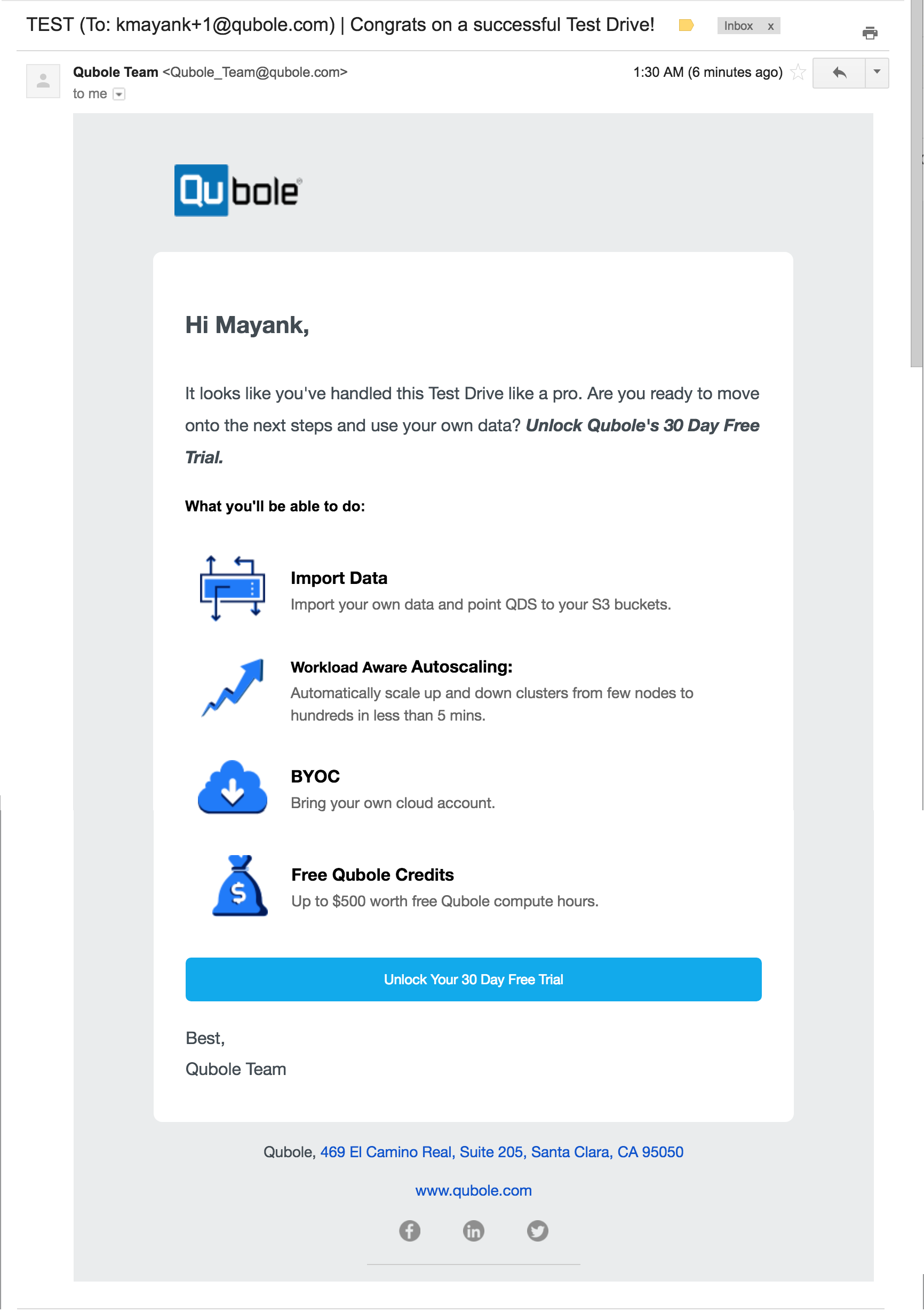
Nurture
Ok so far so good…we made it easier for the user to sign up and run the first command. She might be a potential customer but the work is not done yet. According to CrazyEgg,
The the first three days are the hardest. If you can keep a user active within your SaaS for at least three days, they are four times more likely to convert.
In order to keep user engagement, together with the Marketing team, we created a nurture flow where at every point we looked at the existing user activity and triggered an appropriate email prompting the users to take an action.

Sample Emails
-

- welcome email

-

- no activity

-

- unlock free trial
Key Takeaways
We have started seeing improved conversions, specially pre sign up screens. Below are the key takeaways,
- We saw a ~200% increase in users signing up through a combination of optimization steps mentioned above.
- Users running first command has improved to 22% but we still see scope for improvement. Through usability testing and analytics we found that the product tour which takes user through a path to run a command isn’t working.
- The nurture emails themselves helped ~15% users run their command after receiving the email reminding them to run their first command.
Next Steps
Overall metrics show that the prospects converting to opportunity has improved but there is still room to grow this number. We plan to achieve this through constant experimentation, including messaging changes, providing Aha! moments, and introducing the user to new use cases.